
5/15/13
5/13/13
In class wed May 14th
Presenting to the Chamber Board!
Final Thoughts
Final Exam Schedule
Monday 12pm - 3pm
12:00 - Meg
12:10 - Christine
12:20 - Michaela
12:30 - Robby
12:45 - Devante
12:55 - Teresa
1:10 - Emile
1:20 - Kier
1:30 - Marie
1:40 - Jemma
1:50 - Molly
2:00 - Joe
5/6/13
In class Mon May 6th
Talking about the logos!
lets look.
how about a search for "Chamber of Commerce"
or
"Otsego county"
Work on Projects!
5/1/13
In Class Wed May 1st
Class will start at 2:10pm today!
(I'm in a meeting)
Logos for Campus Theme
Logo for Otsego County
4/29/13
In class Mon April 29th
Logo Project


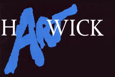
Hartwick Artschool logo
h"ART"wick
LEADs
(Leadership, Education, and Assistance for Disabilities)
- looking to create their own original logo
the clients will be here this week to discuss what they want.
Campus Theme Logo
Hartwick College students, staff, and faculty, are invited to submit original designs for a logo for the 2013-2014 Campus Theme: Exploration.
Members of the Campus Theme Committee will select the winning design from all logos submitted by 5 p.m. on Friday, May 3.
The winning designer will receive a Nook HD tablet. In addition, the winning logo will be featured prominently in a variety of places throughout the coming year. The logo will appear on the Hartwick website, on posters and flyers, and in email announcements relating to the theme.
Guidelines:
1) Keep it simple. The logo will often be displayed at one and a half inches in height or smaller. Design your logo so it will still have visual impact at a small size. Don’t use too many colors or overlays.
2) Your design must incorporate the following text in some form:
Exploration
Hartwick College
2013-2014 Campus Theme
Hartwick College
2013-2014 Campus Theme
3) Files must be submitted electronically and have a minimum resolution of 300 dpi. The minimum printed height for your design should be 6 inches.
4) PDF, JPEG, and TIF file formats are preferred. RGB color formatting is acceptable.
5) All photos, illustrations, images, and text in logo designs must be original, or in the public domain. If you use materials that are not of your own design, you must be able to prove upon request that they are in the public domain. Designs using copyrighted materials will be disqualified.
6) No more than two entries per person.
DEADLINE: Send your design to morsed@hartwick.edu by 5 p.m. on Friday, May 3. Submissions received after the deadline may not be eligible for the prize.
More information on the Exploration theme is available here.
If you have any questions about the logo contest, please emailcampustheme@hartwick.edu.
Otsego County Chamber of Commerce
They would like to stay with the blue and yellow colors.

Other feedback I received from the Chamber:
- AIM -Advocacy, Influence, Membership- is used to describe the Chamber. If this can be incorporated somehow.
- The Chamber is looking for a simple logo that incorporates arrows for direction/moving in the same direction
- The mission - To continually improve the overall business climate in the region; To strive for an atmosphere which attracts investment; to build a positive, forward-thinking business community; and to partner with government, groups, individuals and institutions.
- Students can also visit the website at www.otsegocountychamber.com
Logo Presentations
1:50-4:55pm wed 5/15
Final 12-3pm mon 5/20
Steps in the Graphic Design Process:
- Analyze the audience.
- Determine the purpose of your message.
- Decide where and how your message will appear (whether it will be a printed publication, presentation, or web site).
- Establish goals.
- Organize text and graphics.
- Choose an appropriate format and layout.
- Select appropriate typefaces, type sizes, type styles, and spacing.
- Add and manipulate graphics.
- Organize text and graphics.
- Proofread
- Refine and fine-tune.
4/23/13
4/21/13
In class Monday April 22nd
Class will start at 2:00pm today!
Cutting Stencils
You need to have your 4 images printed and ready to cut out today!
Lets talk about logos!
4/16/13
In class wed April 17th
Your 10 Stencil images are due today as jpeg files in a folder with your name on it. Hand it in on your USB thumbdrive.
.
1st Critique of Stencil Project!
Lets talk about the Upcoming Logos.
Otsego County Chamber of Commerce
h'Art'wick logo for Art School
LEADs (leadership Education and Assistance for Disabilities)
maybe
Cooperstown Chamber of Commerce
Steps in the Graphic Design Process:
- Analyze the audience.
- Determine the purpose of your message.
- Decide where and how your message will appear (whether it will be a printed publication, presentation, or web site).
- Establish goals.
- Organize text and graphics.
- Choose an appropriate format and layout.
- Select appropriate typefaces, type sizes, type styles, and spacing.
- Add and manipulate graphics.
- Organize text and graphics.
- Proofread
- Refine and fine-tune.
4/15/13
In class Mon Apr 15th
Public Art or Graffiti?
Work on Project
We will be reviewing your images on Wednesday.
Your images should be saved as JPEG files in a folder with your name on it.
4/9/13
In class Wed April 10th
Project 4 will be critiqued today. You will need 20 printed copies of your poster for the crit.
The first 10 images for Project 5 are due next Wednesday April 17th as jpeg files on your thumbdrive.
Work on Project 5
4/7/13
In class Mon April 8th
Work on Project 4 and Project 5
Joe will not be in the lab until around 3:00pm.
Class will end early for the Junior Review Opening at 4:30pm. You should all go and check out the show!
Project 4 will be critiqued on Wednesday April 10th. You will need 20 printed copies of your poster for the crit.
The first 10 images for Project 5 are due next Wednesday April 17th as jpeg files on your thumbdrive.
4/2/13
In class Wed April 3rd
Making a Stencil in Photoshop
- Finding a "useable" image
- It's all about "threshold"
- positive or negative
- cleaning it up
- print it out
1st review of project 4, day 2
taking a look at Project 5
Work on Projects
4/1/13
Art Show Opportunity
Hartwick Student Art Show at CANO
CANO
the show - April 12-19th
bring submission to CANO tue/wed between 4&6pm
You need label info and your contact info
Your Piece needs to be ready to hang
3/31/13
In class Mon April 1st
Visual Art in Public Spaces
Banksey
Shepard Fairey
Commercialism vs Advertising
You should have a digital file of your unusual for sale poster "mostly" ready for review. The class will have 1 hour to work before handing the file in.
1st review of project 4
taking a look at Project 5
3/19/13
3/18/13
In class Mon Mar 18th
The creation of reality:
Question, Who was the first president of the United States?
Awesome "text" based public art piece.
More on Copyright ©
How does it work for you?
- Immediate protection of "content" you create for up to 75 years after your death.
Is it easy to protect your copyrighted work?
- NO, Why?
What can you do.
- Time stamp it up online. Blogs work well.
- Register your crated works with the copyright office online.
- Get a copyright lawyer to take care of your content.
Critique Project 3
Work on Project 4
3/12/13
In class wed Mar 13
© Copyright
U2 vs Negative Land

Roy Orbison vs 2 Live Crew

Creative Commons ©©
Where can I get legal content to use thats Free!
ccMixter
Archive.org
Fair Use
US Gov
Wiki
Lets Talk Paper
The thickness of paper is talked about in terms of "weight." This is figured out comes by calculating the weight of a stack of 500 sheets of some type of paper.
Common Paper weights
Paper Weights and Paper Types
Paper comes in many types & surfaces:
- Matt
- Glossy
- Water Color (hot press & cold press)
- Photo
- Colored
Check out what iprintfromhome.com has to offer
Project 4 assigned
Work on Project 3
3/10/13
In class Mon Mar 11th
Class will start at 2pm today!
What is Propaganda?
Propaganda Print from WWII
.
.
................................
................................
So how do you think this fits into the concept of Propaganda?
Pet Cat Lost!
What is Propaganda?
Propaganda Print from WWII
.
.
................................
................................
So how do you think this fits into the concept of Propaganda?
Lets talk Color
- What do colors mean?
- How do colors work in the computer?
- RGB vs CMYK
- Colorsync
--- Assigning a colorsync profile
Color in Photoshop
* the Histogram
- Levels
- Adjustment Layers
- Colorsync
Joining the Flickr Group
Work on Project
Project 3 Due Monday March 18th
3/5/13
In class Wed Mar 6th
Barbara Kruger: Crossing the line between Design and Art
.
Pattern examples from past classes
Critique Project 2
Project 3 Due Mon March 18th
.
Pattern examples from past classes
Steps in the Graphic Design Process:
- Analyze the audience.
- Determine the purpose of your message.
- Decide where and how your message will appear (whether it will be a printed publication, presentation, or web site).
- Establish goals.
- Organize text and graphics.
- Choose an appropriate format and layout.
- Select appropriate typefaces, type sizes, type styles, and spacing.
- Add and manipulate graphics.
- Organize text and graphics.
- Proofread
- Refine and fine-tune.
Layout in Photoshop
- Preferences
- Guides, Rulers & Grids
- Unprintable boarder
- templates
- single page, multipage, 3d (box)
Critique Project 2
Project 3 Due Mon March 18th
3/3/13
In class Mon Mar 4th
Project 2 Due At the beginning of class.
Project 3 Assigned
Patterns
William Morris 1834 -1896, English Textile Designer
Photoshop basics
- Opening a File
* DPI
- Image size - used to change the amount of pixels in the image
- Canvas size - used to add extra pixels to the image
- Save:
* File Types
--- Photoshop .PSD file is your working file (keep this forever)
--- JPEG file is a 'Flattened' and Compressed file
Printing dpi resolutions
180 dpi - for images with no text only. lowest possible printing resolution.
240 dpi - good for images and fonts 11 points or bigger
300 dpi - great for images and fonts 8 points or bigger
360 dpi - great for images and fonts 6 points or bigger
400-600 dpi - super hi-resolution as good as an image can look
How to make a Pattern in Photoshop
1. Find an image
2. crop as you wish
3. Double the hight of the canvas. Center your image at the bottom of the canvas.
4. Cut and Paste your image onto a new layer
5. Edit-->Transform-->Rotate-->Flip on the horizontal your new layer
6. Move your new layer to the top of the image
7. Flatten the Image
Ding!! Your Pattern is done.
* try doubling the size of the width and repeating the process to extend your pattern.
Try to make some patterns in class.
*You need to create 12 hi-rez patterns for the assignment!
2/26/13
In class Wed Feb 27th
If design is about solving problems, then how do we know if something is broken?
Ideology of 'Broken' [video]
Finish Crit of Project 1
Work on Project 2
2/24/13
In class Mon Feb 25th
Advanced Design Concepts
Scott McCloud - Understanding Comics
* get one on Amazon
Reality - Language - the Picture Plane (design elements)

Flickr
the Home PAge
- uploading to Flickr
-- jpegs only! resize your images for 1600 pixels on the longest side (free account)
Your Photostream
Viewing an image
Owner Settings
- This is where you set the rules for how your image can be used by the public
- © means all rights are reserved
- ©© Creative commons Licenses offer more possibilities
Tags
- useful descriptive information
Actions
- Send to a group
- multiple image sizes
Sharing
- URL
- Get HTML code
Organize and Create
- Batch Processing
Sets
Collections
Printers
- Printing from Photoshop
- Unprintable boarder
Critique Project 1
Are you keeping up with the Semester Long Project?
Work on Project 2
Work on Project 2
2/19/13
In class wed Feb 20th
Advanced concepts of design
Project 1 Due
Export your images at 300dpi as JPGS.
Hand in your 5 images on your USB thumbdrive, labeled correctly.
Project 1 Crit
Project 2 Assigned Scanner Glitch - Due feb 27th
Goto Artist Talk #1 for Painting Position (Jason Seeley)
- Things to consider when creating, manipulating or viewing an image/design:
Aesthetic Quality – how beautiful or sublime an image’s elements and composition are
Composition – the flow and readability of an image
Image Content – the individual visual elements that make up the image
Image Context – an images context is understood by looking at the visual elements that make up the images content and considering the Historical and Cultural understanding those elements represent in the society and across generations.
Context of technology in comparison to the photographic and print media's image's qualities
The first photographs created were shot on glass plates with a slow film speed that produced Black and White images. As time progressed so did the technology to capture images. This has led to a link between image technology and time in our visual cultural understanding. In photo theory photography is linked with the ideas of memory and time, the capturing of a moment to retain a visual perspective of time. This happens not only from the capturing of the image on film but also through the use of aesthetic related to each generation of technology.
An example: A Black & White or Sepia toned Photograph
(cultural generation 18-35)
- images from the inexperienced past, lived life with color images, images of Grand and Great Grandparents
(cultural generation 36-55)
-images from the remembered past, saw the transition of the snap shot from BxW to Color, images of Grand parents and parent’s childhood photos
(cultural generation 56-90)
-Images from the experienced past, remembers photographs as special objects, images of immediate family and friends from the past, most dead
Scanners
- access the scanners software in Photoshop under "import" or through the scanners software
- make sure your in professional mode
- resolution (dpi) changes the speed at which the scanner will scan
- look at the other scanner options
- try doing everthing you were told not to do with a scanner (like move stuff while scanning)
- all scanners have a distance above the glass which is in focus and then drops off quickly
How To Scan
1 - set up the scanner options
2 - select an area to scan
3 - hit preview
4 - hit scan
5 - save the scan as a PSD
Resolution (DPI)
180 dpi - for images with no text only. lowest possible printing resolution.
240 dpi - good for images and fonts 11 points or bigger
300 dpi - great for images and fonts 8 points or bigger
360 dpi - great for images and fonts 6 points or bigger
400-600 dpi - super hi-resolution as good as an image can look
Project 1 Due
Export your images at 300dpi as JPGS.
Hand in your 5 images on your USB thumbdrive, labeled correctly.
Project 1 Crit
Project 2 Assigned Scanner Glitch - Due feb 27th
Goto Artist Talk #1 for Painting Position (Jason Seeley)
2/17/13
In class mon Feb 18
TYPE
A graphic character created out of metal traditionally used in various printing process.
* Designing with Type is called Typography
* Different styles of type are called typrfaces, on the computer they are called fonts.
* Font size is measured in points
Fonts come in different flavors
- Serif & San-Serif Typefaces
- Bold & Italic
~ Text in Flash is Vector so it is scaleable and can be manipulated.
* Text Tool
- Modify --> Break Apart (do it twice if you need to)
*Images
- Import
--- JPG, for Photo Quality and small file size(use 'Save for Web' in Photoshop)
--- GIF, to keep the edge and color of solid graphics (use 'Save for Web' in Photoshop)
--- PNG-24, Photo Quality & Transparency (use 'Save for Web' in Photoshop)
* it goes into the 'Library' look for it under Windows --> Library
- Trace Bitmap
- Optimize
work on project
Project 1
ART216
Type Space Design
description:
Letters are are symbols. Designers call letters 'type'.
- Create a design using your asigned letter only once on the page. You can use any colors or fonts you want.
- Create a design using your assigned letter, using only one color, but as many multiples of your letter in any sizes you want.
- Create 3 designs using any letters, colors, or sizes of font(s) you want.
whats due:
- your final images need to be uploaded to your Flickr account and sent to the Art216 group.
- your final images saved as high quality jpegs named first name - last name - and the number. ie Joe-vonstengel-1.jpg
Guidelines .
Think about the Basic Prinicipals of Design. Consider how the; alignment, repetition, contrast, proximity and balance are created by the Design Elements of you letter(s)
What should you do?
- To successfully complete this assignment you should create at least 10 versions of each of the first 2 images assigned and a fewof each of the last 3. At this point creating more, faster, is better then sitting and contemplating on a single image.
Due: at the beginning of class Wed Feb 20th
2/12/13
In class Wed Feb 13th
Basics concepts of design
Design is the balance between Content and Aesthetic created through the merger of Symbols, Images and Language.
Symbols represent ideas and concepts.
Images represent Reality or Anti-Reality.
Language is written as text. Text is made up of letters. Letters are symbols.
Designing for a 2 dimensional plane
Looking for a focal point!
- Rule of Thirds

- Golden Ratio

-Sacred Geometry

The Platonic-Solids

- Design Elements
line
shape
color
texture
value - how dark or light an element is
space - positive & negative
- Basic Principles of Design
alignment
repetition
contrast
proximity
balance
Flash - drawing basics
Whats Where?
- Tools
- Stage
- Timeline
-- layers
-- locking layers
-- keyframes
- Properties
Changing paper size and proportion
--> Modify --> Document
Zooming in and out
Using the Tools
- Basic Shape tools
- Selection Tools
- Text Tool
--> File --> Save As
Whats Where?
- Tools
- Stage
- Timeline
-- layers
-- locking layers
-- keyframes
- Properties
Changing paper size and proportion
--> Modify --> Document
Zooming in and out
Using the Tools
- Basic Shape tools
- Selection Tools
- Text Tool
--> File --> Save As
* Project 1 Type Space Design - Due Feb 20th
2/7/13
In class mon Feb 11th
Hello and Welcome to the Digital Art & Design 2, Digital Print Media. You are currently looking at the blog for the class. This blog will contain all the information you need for this class including up-to-date information on what will be happening in class, project specifics, examples and the syllabus..
take a moment to click around and check things out.
* You will need a 4 GB thumbdrive.
So what is the difference between Art & Design?
Here is our first example of digital print media as subversive street art.
Here is Paul Rand the God Father of modern design.
Lets Play with Flash!
take a moment to click around and check things out.
* You will need a 4 GB thumbdrive.
-- What is Print Based Media --
Print based media
- Illustration
- Graphic Design
- Image creation/Manipulation (remix, reprocessing, mashup)
Areas of study
- Graphic Design to sell an Idea or Object
- Art that uses the elements of Graphic Design as the Art medium
- Print Media in Public Spaces
So what is the difference between Art & Design?
Here is our first example of digital print media as subversive street art.
Here is Paul Rand the God Father of modern design.
Lets Play with Flash!
Subscribe to:
Comments (Atom)